My Process and Methodology
To create better products by studying user behavior and interactions across channels. Provide greater understanding of the current user pain points and the problems we are solving for and capture the best features for the design of the application. Highlighting the need for Design Thinking and recommend process changes with Design Thinking.
I believe effective design comes from collaboration, rapid prototyping, applying the scientific method and enhancement through iteration.
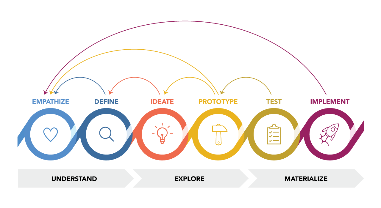
Design Thinking Methodology
1. Gathering Data
- Develop personas based on collected information on product user groups
- Find opportunities based on understanding user paths
2. Hypothesis
- Everything starts with a testable hypothesis (If [variable], then [result] due to [rational])
- Develop Site maps of the ideal-state user experience and wireframes, based on the data achieved
3. Experiment
- Usability test designs theories to validate or rule out design decisions
- Test out an alpha vs. beta interface decision to see what type of interactions, through traffic the elements instigate
- Remove graphical elements A/B test and see what happens
4. Act
- Document test results adamantly (hypothesis, screenshots of test, raw data, decisions, what we learned)
- What learnings do you want to carry on
- Create checklists based on learnings
My Principles
Be Understood
Help the user accomplish their goal with a “quiet” interface. Tasks should be simple, unobtrusive. The user shouldn’t think about what they have to do next. User-centered design presents tasks/steps in a way that the user expects and comprehends.
Be Responsive
Not only responsive in terms of being accessible on numerous devices, but also allows users to complete their goals quickly. Reduce time for users to complete tasks, and provide appropriate feedback on those tasks.
Be Human
Human centered design focuses the end user of the product. User Personas help to relate and empathize with the user, understanding how they think; this then informs the appropriate design decisions.
Products Standards
Creating High Standards.
The results defined by a team of experienced interaction designers creating a visual language and style that focuses on foundational design principals, as well as, best practices for Human–Centered Design. The goal, to create a single unifying theme across all our products.
These guidelines are continuously, reviewed, revised and expanded to suit the changing needs of our products.

Experience Map
A strategic process of capturing user interactions within our products. The user path provides greater understanding of the current customer pain points and the problems we are solving for and capture the best features for the design of the application.
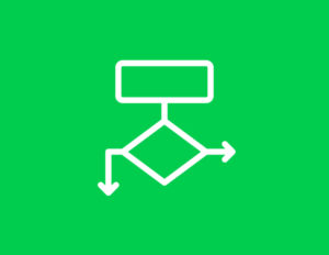
Site Maps / User Flows
A hierarchical diagram defining the entire application structure and interactions the user will take to navigate the user interface.
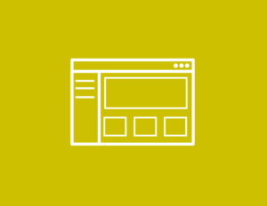
Wireframe
Is an architectural blueprint of a user interface, which defines the hierarchy of content and functional elements on the screen, representing the format and communication needs of the user.
“The wireframes are the floor plan for your website, creating a vessel for which design and content can flow into.”

Style Tile
Style Tiles consist of defining the fonts, colors and interface elements that communicate the visual language for the application interface. This provides a catalyst for discussions around the preferences and goals of the application.
Style Tiles are similar to the paint and fabric swatches an interior designer relies on before designing a room.
High Fidelity Mockups
The high fidelity mockup brings together all the artifacts we’ve created to provide a visual representation of the final product.

